Hostel and hotel in Silverthorne, CO, aiming to fully open their doors to the public in 2021. Providing accomodation for the modern traveler with different room options ranging from hostel-style to high-end suites at an affordable price in beautiful Summit County. Allowing their guests to prioritize experience, adventure and to focus their spending on activities and experiences in the Rocky Mountains and surroundings, The Pad describes themselves as "Silverthorne’s first boutique hotel/hostel in the heart of Colorado ski country."
Creating a logo and brand identity with several hotel locations in the works, and a brand that feels adventure-focused, modern and fun.
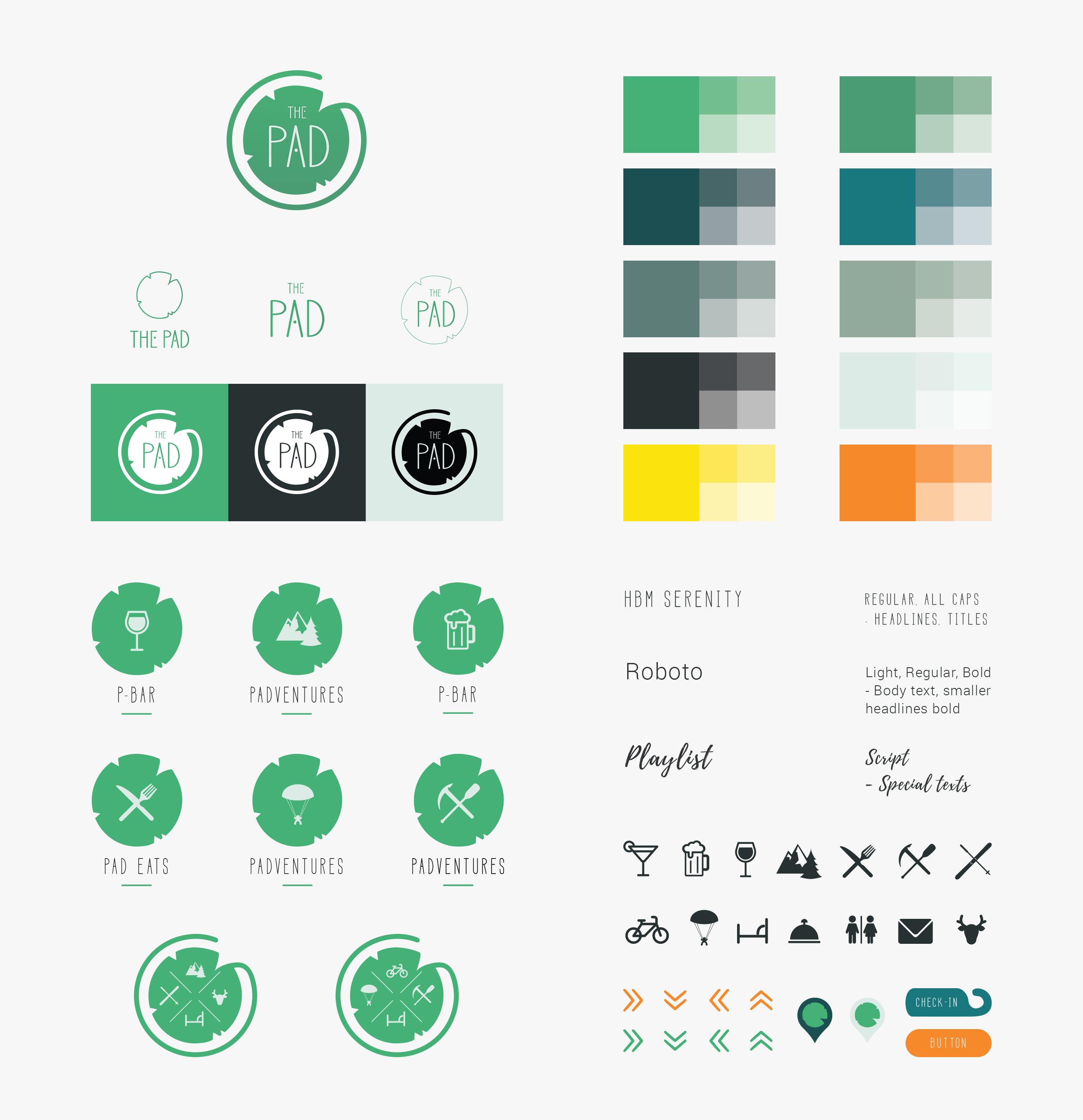
A lilypad allowing you to jump from one pad to the next and still get the same experience encapsules this new logo, communicating a fun and inviting place to stay. The design system was created with versatility and expandability in mind.
Logo Design:
Branding:
My Role:
Met with the owners to pick their brain about their vision for this new hotel and from there I drafted up a couple of ideas based on their input as well as industry research. The idea of the lilypad really stuck and I created a flat vector version as it needed to be dynamic to fit all possible uses in the future. The focus of the color palette and design system is primarily nature and being adventurous. Using the pad throughout, I created a couple of sublogos for possible future use cases, such as the Padventure, Pad Eats and The Pad adventure packages.


If you'd like to know more about me or any of my projects, feel free to check out the rest of my website - or email me directly at hello@elindesigns.com.
